
Created with everything we got :
our sweat and tears\mind and soul\time and effort
#BS_Case:
Fat Hen Chicken is the new go-to fast food spot for food lovers, specializing in tender fried chicken burgers made with fresh, from-scratch ingredients that burst with flavor. Brought to us by Chef Arrand & Rosewood Hospitality Group, Fat Hen Chicken is located at the heart of UB.
#BS_Challenge:
To create a brand visual identity and logo design that’s distinctive, welcoming and soulful. To tell the story of a classic fried chicken burger joint through simple visual design.
#BS_Solution:
After a successful run as a pop-up during the pandemic, the owners of Fat Hen Chicken began their plans to open a permanent restaurant in 2021 and tasked the Brainstorm team to rebrand their store with a new logo and brand look.
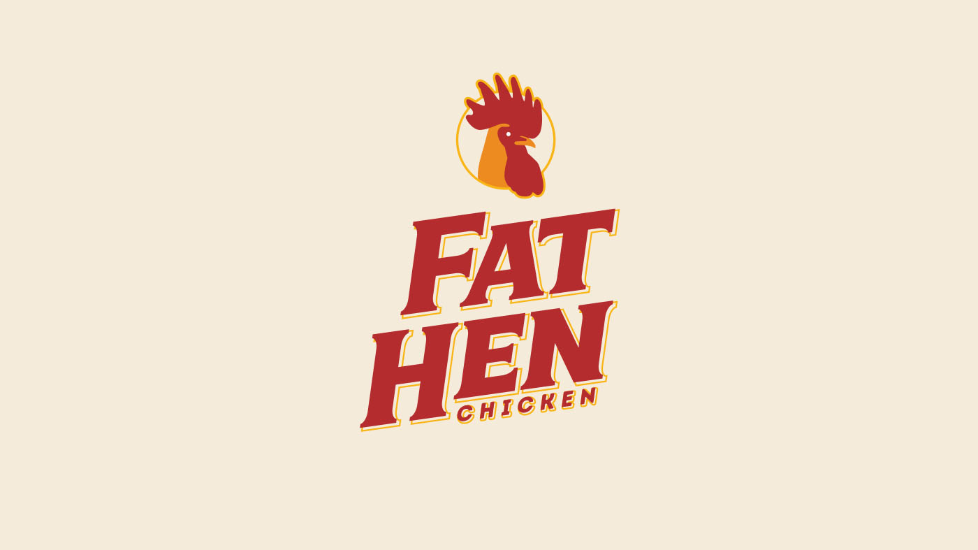
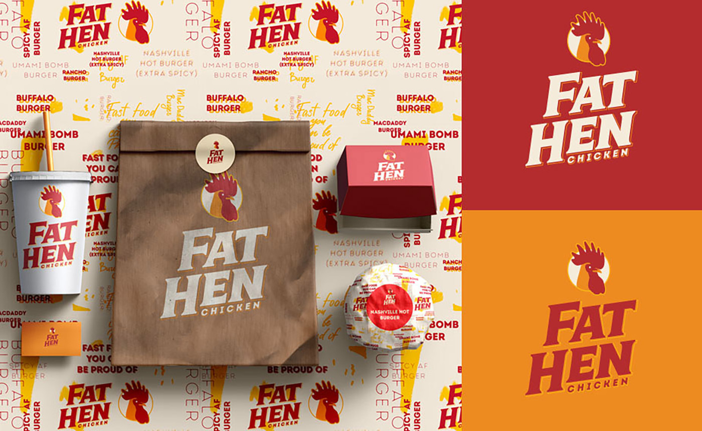
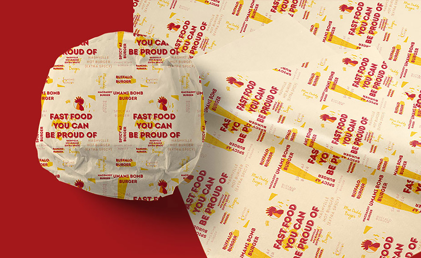
Taking inspiration from printmaking techniques such as woodblock printing and the classic look of a typewriter, we aimed to give the logo typography an old-fashioned feeling that welcomes customers and resonates with them. For the package design, we added design elements such as handwritten letterings to give life to the burgers and highlight its freshness and burst of flavors.
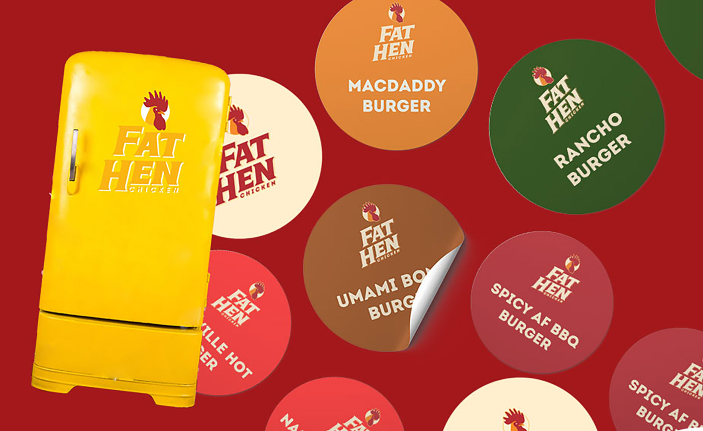
Fat Hen Chicken’s visual profile is predominantly made up of muted tones of red, orange and yellow. These colors are known to increase appetite and induce hunger and are widely used by fast food restaurants across the globe for this purpose. We muted these bright colors to fit into the familiar feel of the brand.
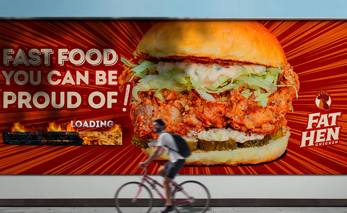
Because the quality and taste of the burger speak for themself, it was enough to keep the logo simple and straightforward, yet soulful, welcoming and appetizing. No gimmicks necessary. The old-fashioned typography, combined with the appetite-inducing effects of warm colors create a cohesive brand look that’s resonant of a classic Southern charm and its famous fried chickens. A modern blend of tried-and-true, old-fashioned design techniques that create the new “new” in UB.
